Tyto Care Wins Prestigious iF Gold Design Award 2017

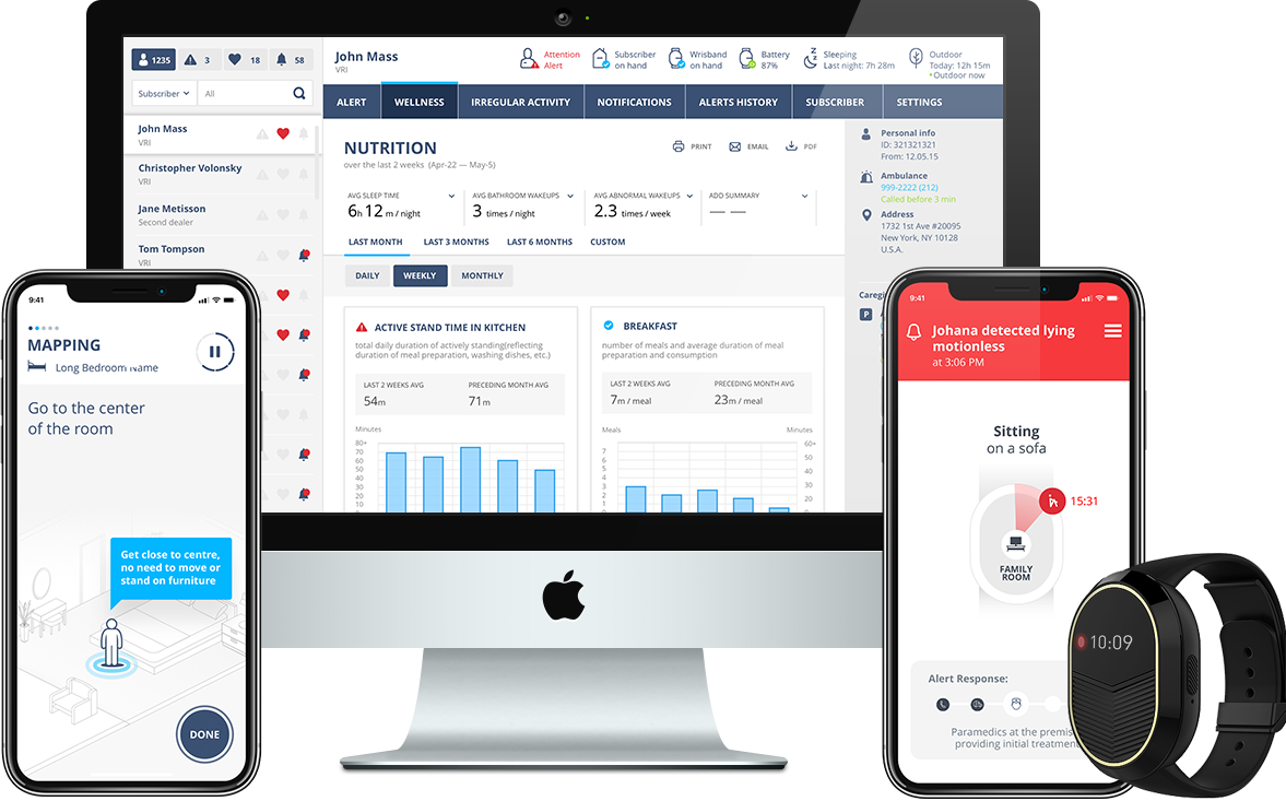
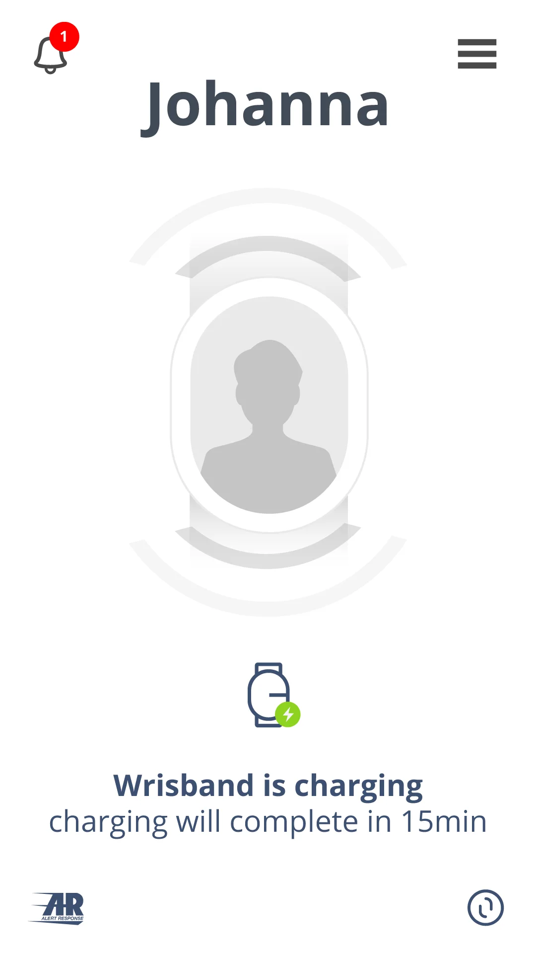
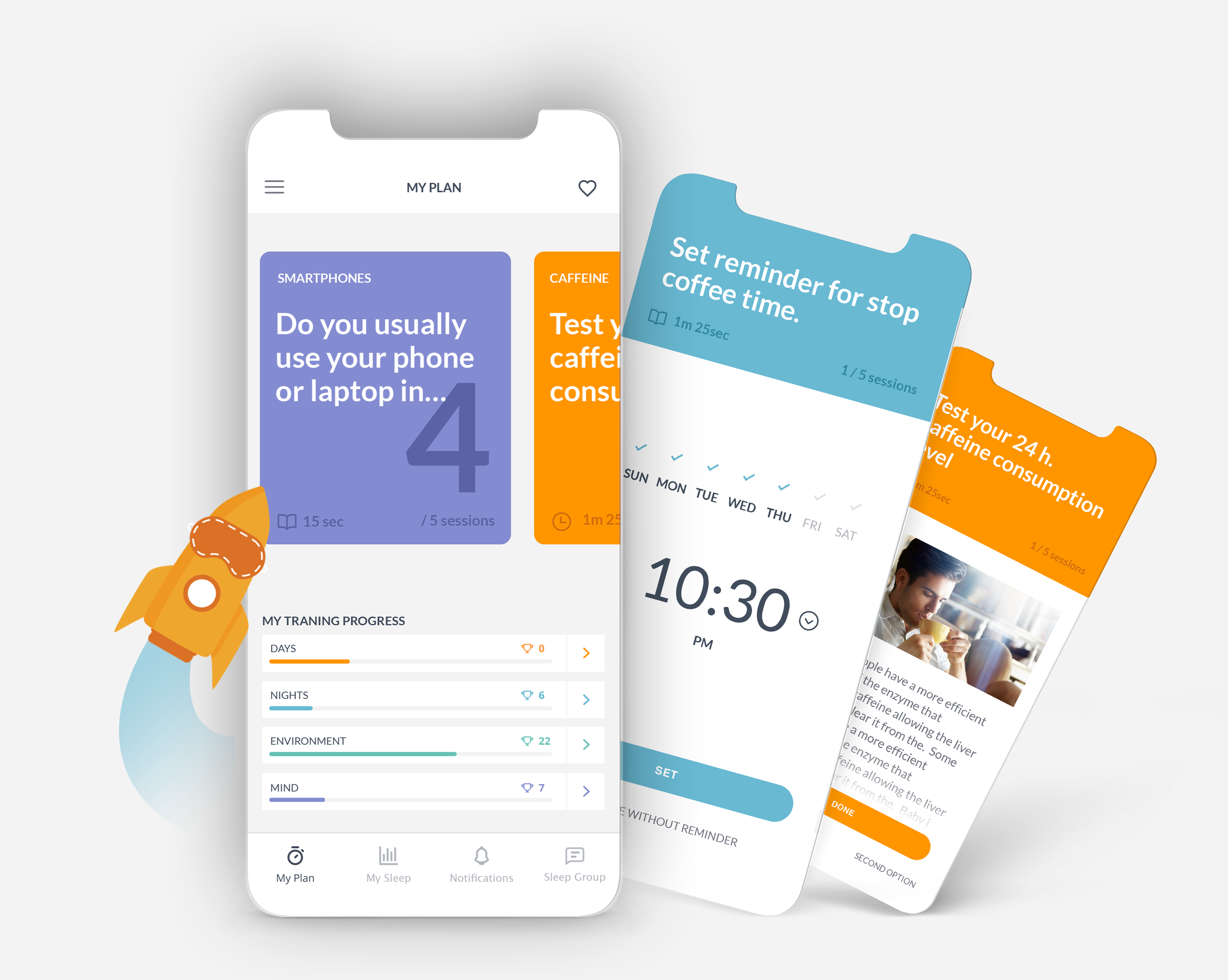
TytoHome integrates all the key elements of a traditional medical exam into an easy-to-use device.
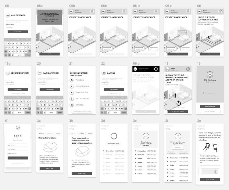
What I did:
After demonstrating first ideas to physicians and regular users it became clear to Tyto that their audience was looking for ease of use and a better experience.
Thus, we began working together in order to investigate, ideate and design a better way for users to interact with the sophisticated technology Tyto had already built.
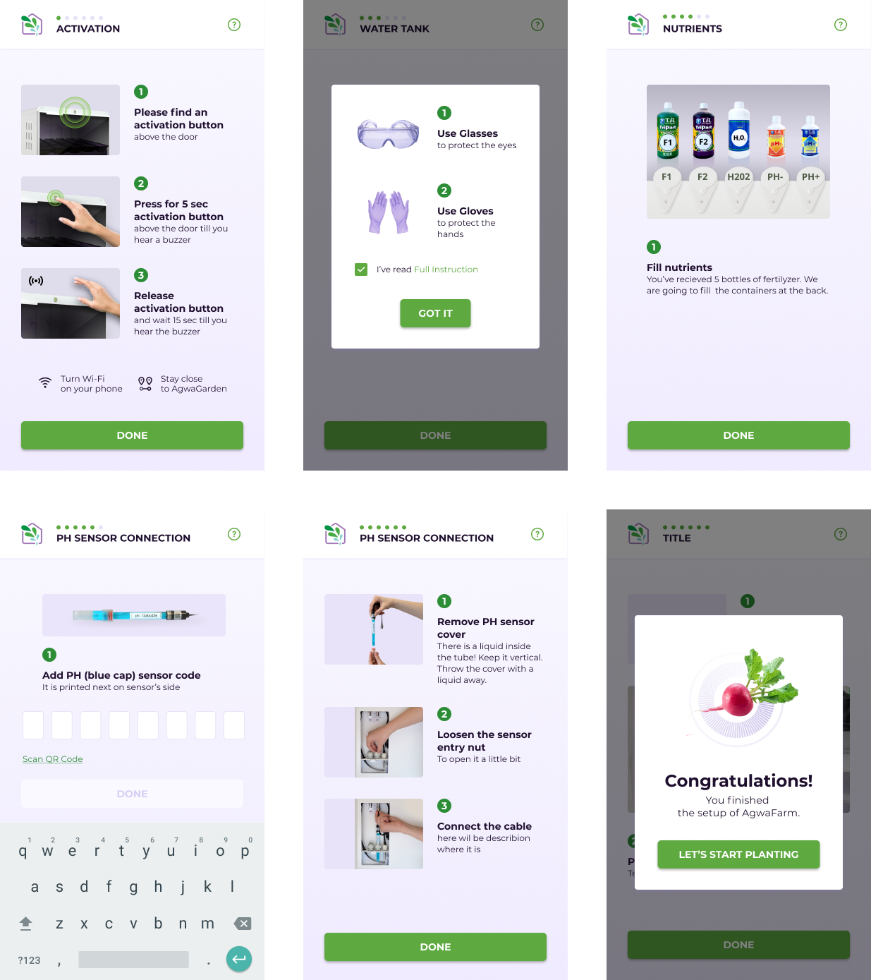
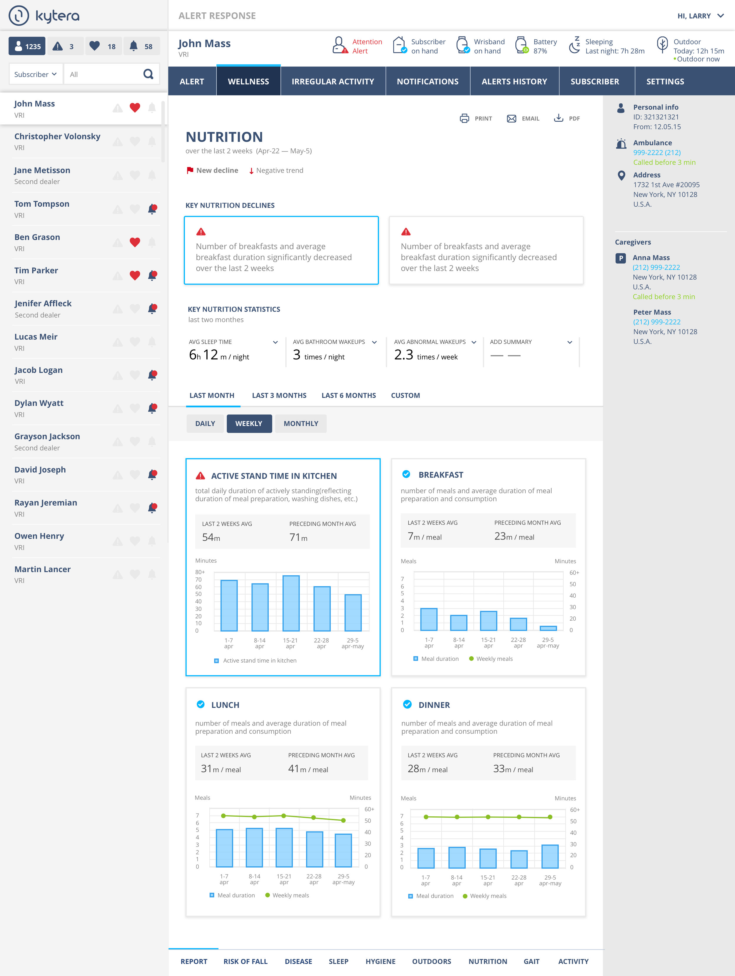
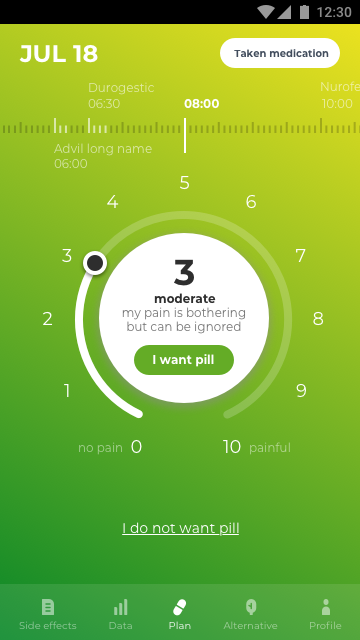
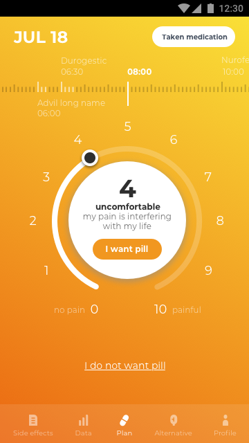
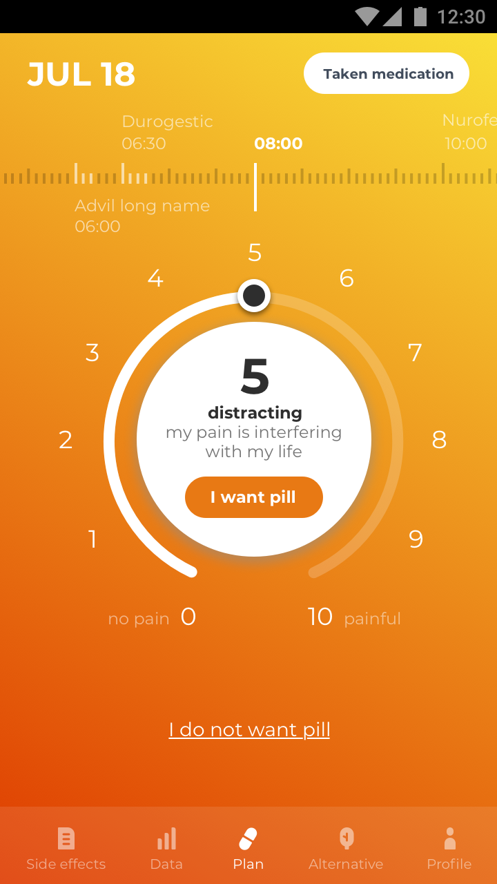
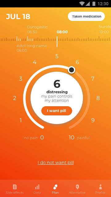
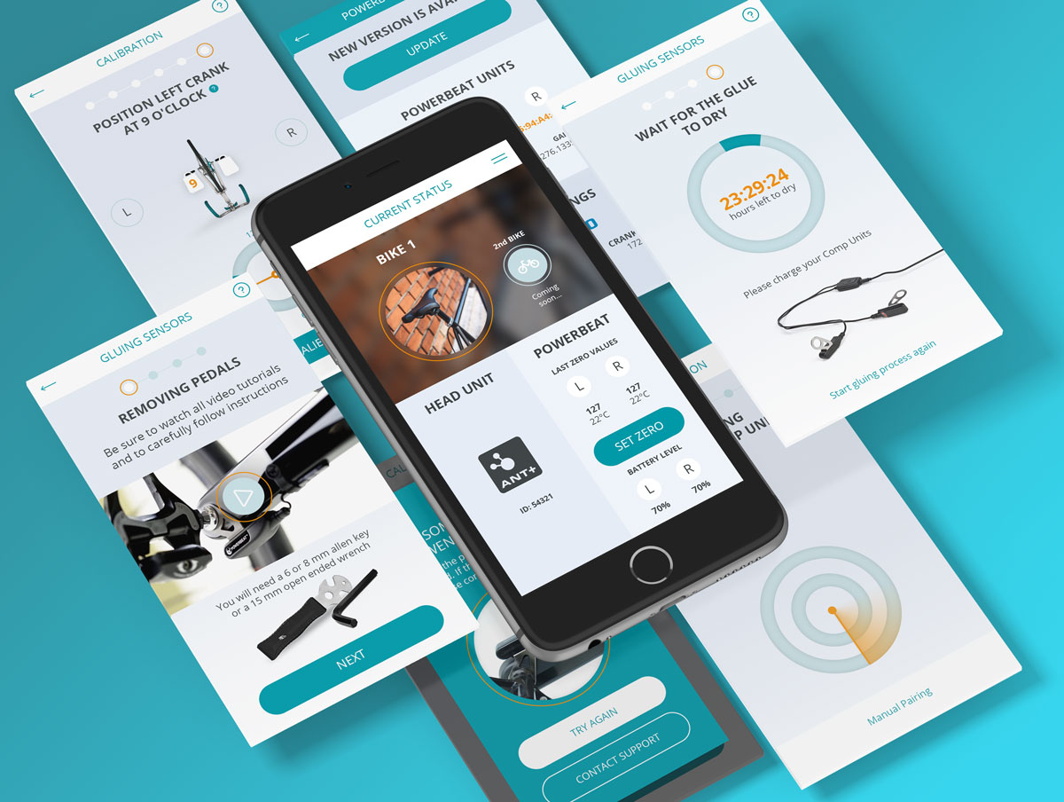
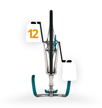
Tytocare's product, is a system made up of a hardware device, user's smartphone app and clinician's station.
“
Finally, consumers are beginning to take their health into their own hands. Tytohome offers convincing technology, design and user experience to revolutionarily change the way of medical examination. It integrates all the key elements of a routine and even an urgent doctor visit into a reliable set of easy-to-use devices. This design makes it possible to conduct a medical examination almost anywhere, at any time.


Analysing Goals
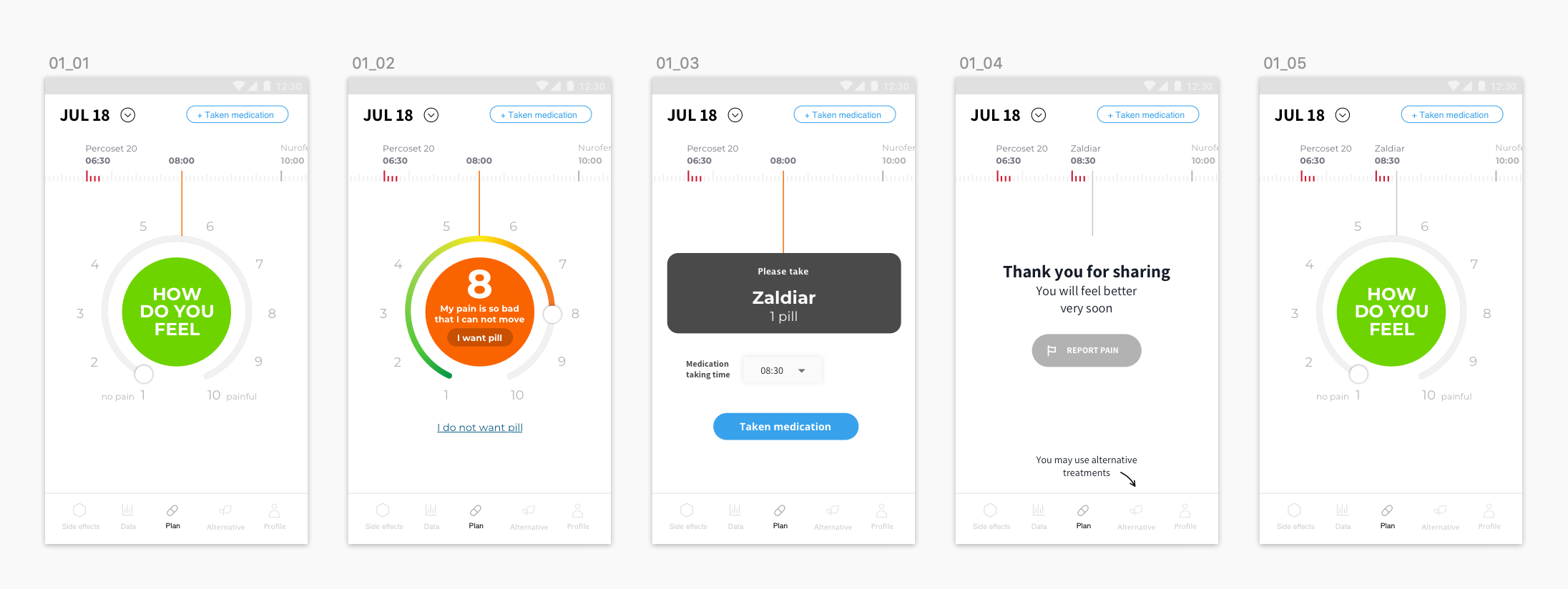
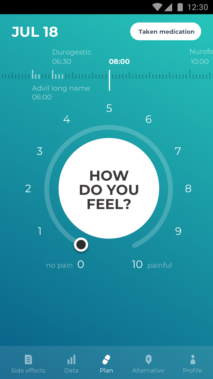
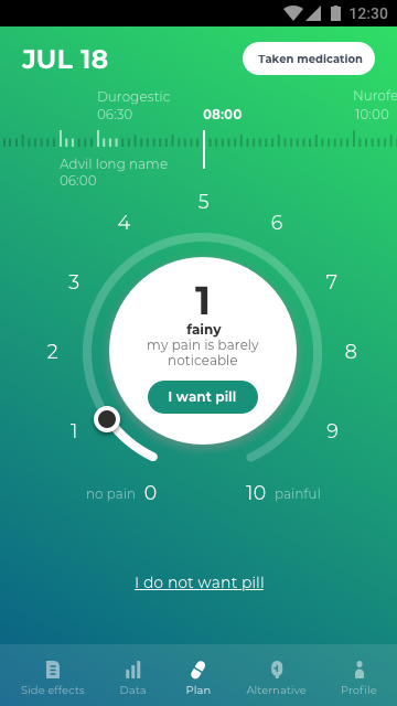
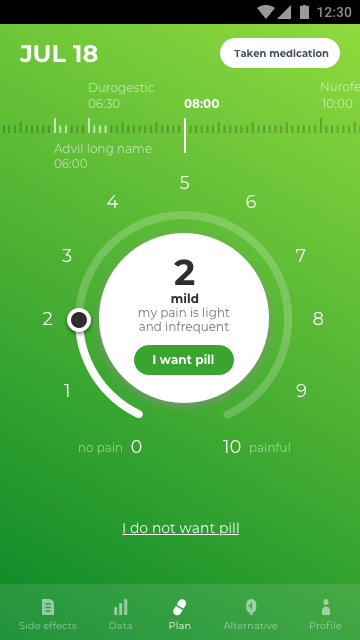
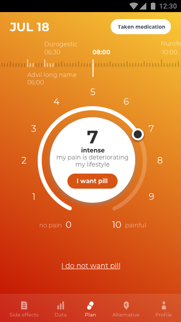
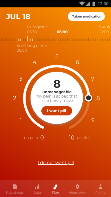
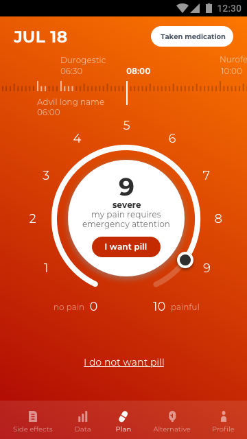
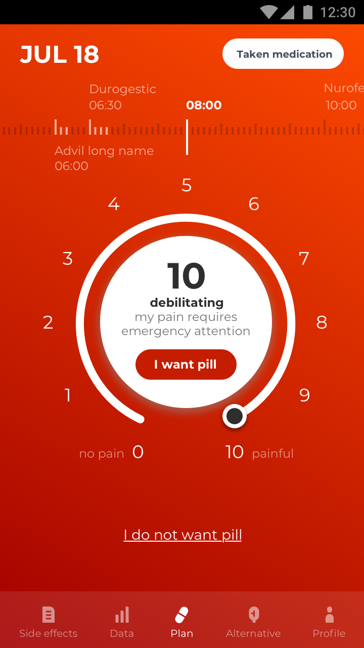
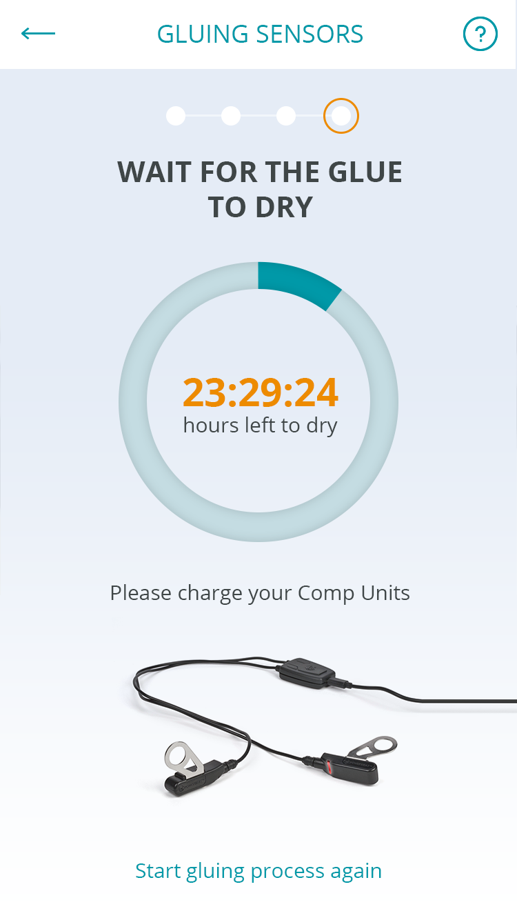
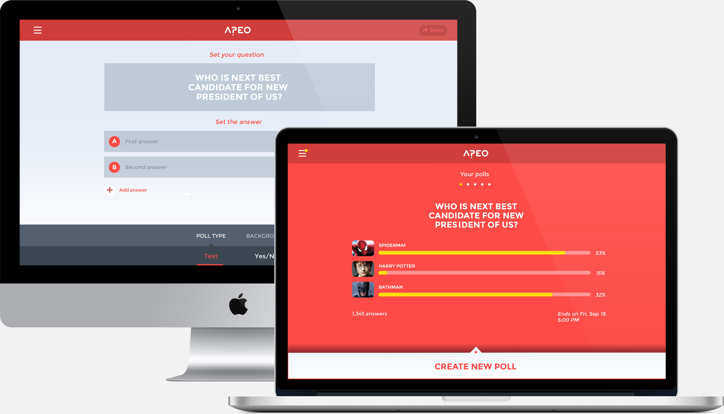
As usability issues were already identified at this stage, the first step was to look at the system itself to evaluate the user interface and identify the areas where improvement would be most effective, based on an analysis of the goals and the primary types of usage. The guiding principles were simplification, fewer features and a strong focus on usability.

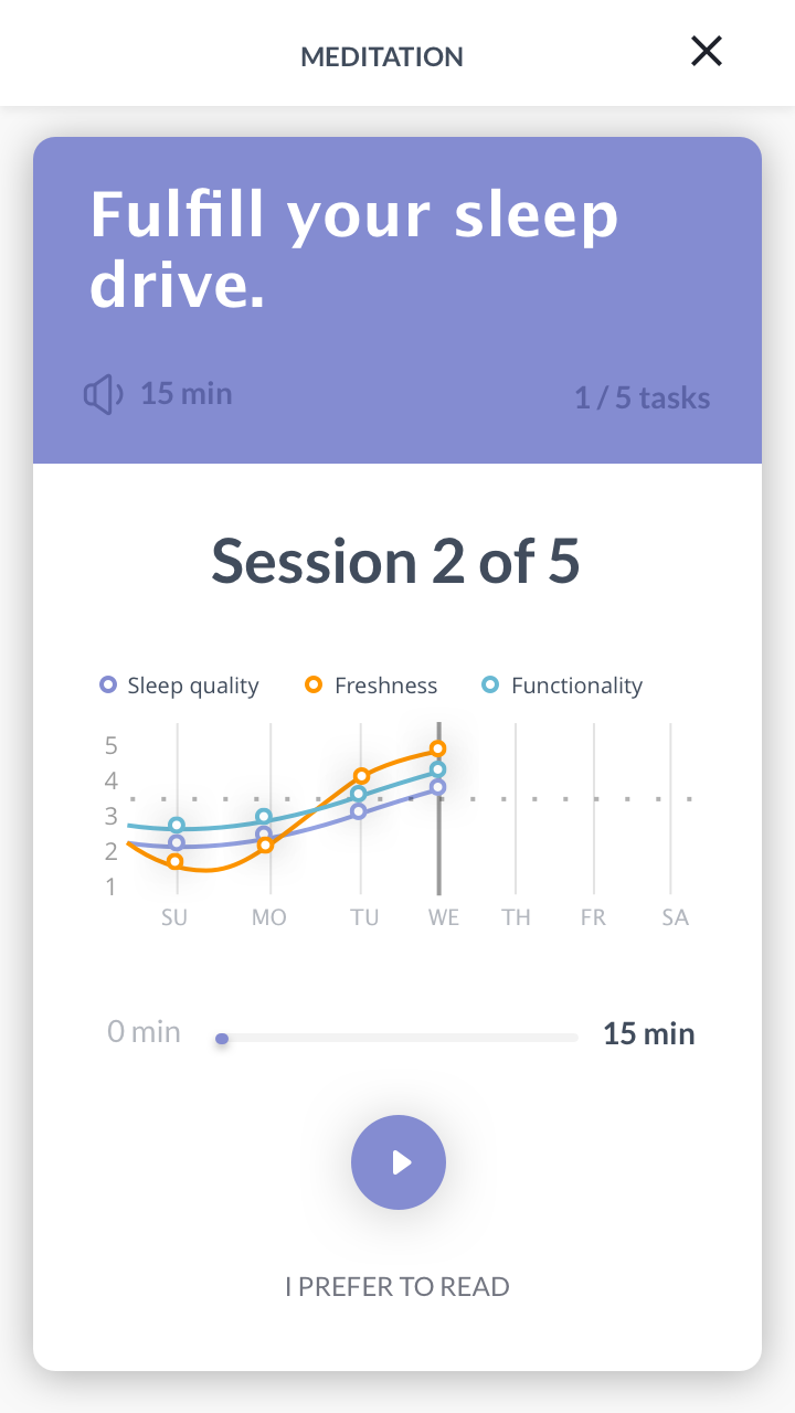
Simple flows
Every extra unit of information competes with the essentials and diminishes their relative visibility.
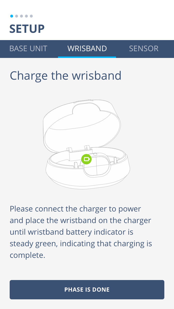
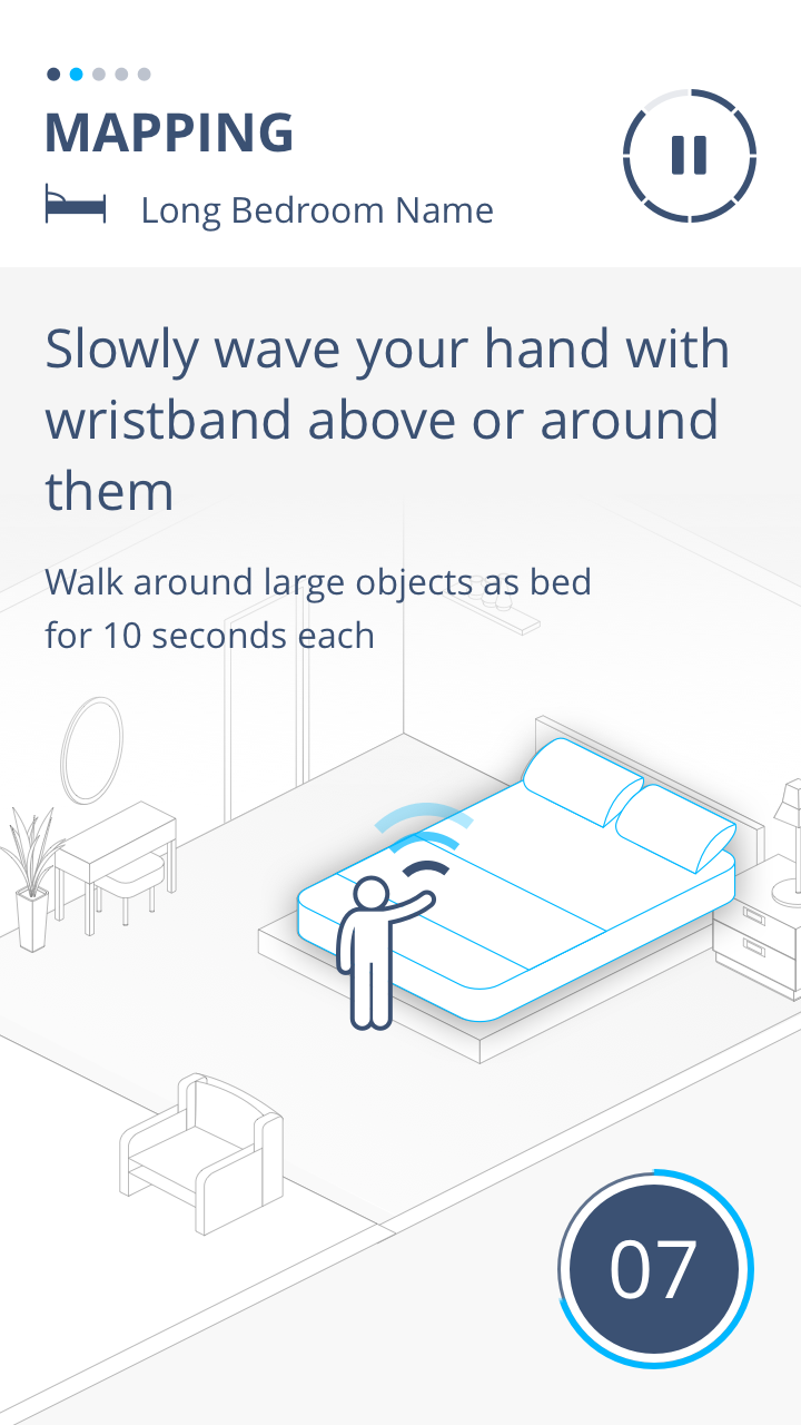
Visible instructions
Instructions for use of the system are easily accessible for the user whenever appropriate.

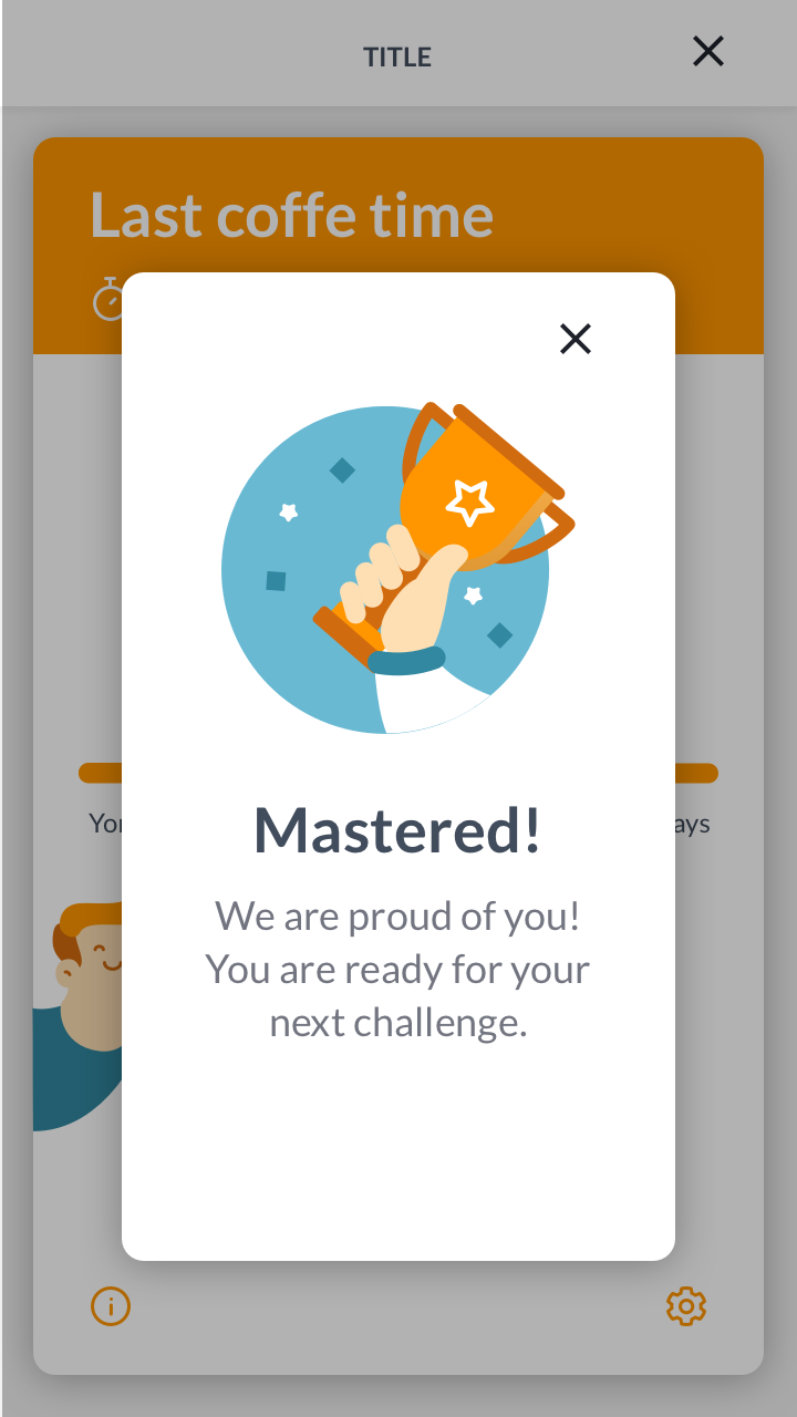
Smart tools
The system keeps users informed about what is going on, through appropriate feedback within reasonable time.
The information architecture was a key point throughout the project.
The development team was closely integrated throughout the process to support and inform their decisions.

Device Interface Design

“What’s beneath the surface is often very complicated. And the work required to make it seem simple and logical equally so. That’s good and well as long as the final interfaces make immediate sense. ”