

SNC is a comprehensive business information platform that provides data on Israeli companies, startups, funding rounds, key personnel, and industry trends, serving as a valuable resource for professionals in business, finance, and technology.
finder.startupnationcentral.org
What I did:
Creating a SNC platform posed several challenges. One main challenge was ensuring a seamless and intuitive user experience while managing vast amounts of diverse data. Balancing a clean, user-friendly interface with the presentation of comprehensive information, prioritizing key features, and designing effective navigation to accommodate different user needs would be crucial. Additionally, maintaining consistency in design elements and optimizing for accessibility would be important to enhance the overall usability of the platform.

“
As a talented UX designer, Ira has been a valuable asset to our project over the past two years.
Ira consistently delivers high-quality user experiences by effectively understanding and addressing user needs. Her strong communication skills, openness to feedback, and knowledge of common UX practices contribute to a positive and collaborative work environment. She excels at creating visually appealing and user-friendly interfaces while seamlessly adapting to diverse project requirements.
Ira’s positive attitude makes her a pleasure to work with, and she consistently meets deadlines while upholding the quality of her work. I have no doubt that Ira will continue to excel in her future endeavors in UX design.

smart Search
When designing the display of search results in complex products like SNC Finder, several UX (User Experience) considerations are crucial to ensure that users can quickly and efficiently find the information they need.

Relevance and Sorting: Search results are sorted by relevance, providing users with the most pertinent information at the top. Users should be able to quickly identify and access the most relevant entries.
Clear and Concise Information: Display essential information in a clear and concise manner, utilizing well-organized layouts, headings, and labels to present data in a way that is easily scannable.
Thumbnail Previews: Incorporate thumbnail previews or icons to visually represent entities in the search results. This can help users quickly identify the type of information they are looking for.
Progressive Disclosure: Implement progressive disclosure to avoid overwhelming users with too much information at once. Initially, display only the most crucial details and provide options to view additional information if needed.
Responsive Design: Ensure the search results interface is responsive and works well across various devices and screen sizes. This is especially important as users may access the platform from different devices.
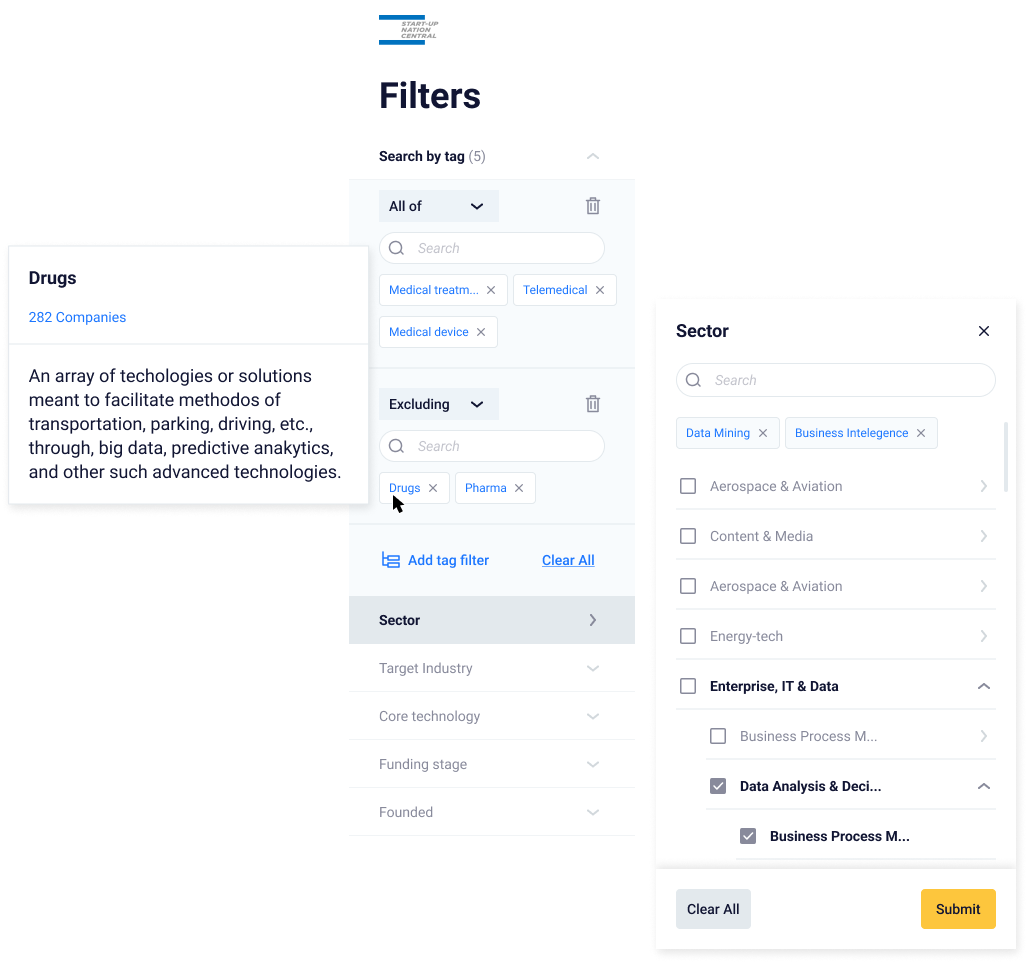
FILTERING system
In projects of this nature, incorporating various filtering options is crucial.
The classic approach involves following a hierarchical structure, providing clarity, but potentially becoming less efficient as the content grows. For instance, using categories such as "Search by Sector" or "Target Industry" exemplifies this classic approach.
Tags offer a flexible, non-hierarchical method, enabling users to assign multiple descriptors for swift retrieval and diverse categorization.
Why Tags?
Flexibility is crucial:
Tags offer more flexibility than folders, allowing for granular categorization. An item can have multiple tags, accommodating a dynamic organizational approach.Cross-categorization:
In our case, where items belong to more than one category, tags are a good choice since an item can have multiple tags, facilitating cross-categorization.Search is a primary access method:
Tags are coupled with robust search functionalities. Given our heavy reliance on search to find information, tags are particularly suitable for efficient retrieval.
Why Classic Categorization?
Clear Hierarchy is essential:
Part of our data naturally follows a hierarchical structure, with items having a clear parent-child relationship. Classic categorization provides a straightforward way to organize information based on this hierarchy.Simplicity is preferred:
A classic structure is simpler and may be more intuitive for some users, offering a straightforward and easily understandable method of organizing information.
Combining Tags and Folders:
Having a hierarchical structure for main characteristics and using tags to add additional metadata
COMPLEX TABLES ON MOBILE
Adapting tables from desktop to mobile presents a unique UX challenge. The change in screen size requires thoughtful consideration to uphold usability and clarity. On desktops, tables typically benefit from ample space, allowing for the display of numerous columns side by side, providing a comprehensive view. However, this luxury diminishes on mobile screens due to space constraints.
One approach to addressing this challenge involves prioritizing information. Determining which columns to display prominently and which to hide requires a delicate balance. The goal is to ensure that essential data remains accessible without overwhelming the user.

substantial amount of data. Desktop VS Mobile.
Effectively presenting a substantial amount of data on a single mobile page can be achieved through strategic categorization and the use of tabs. This approach enhances user experience by organizing information into manageable sections, allowing for easy navigation and access.
Categorization: We begin by identifying key categories that appropriately group the data. This involves analyzing the nature of the information and determining logical divisions.
Tabs for Navigation: Implementing tabs is an efficient way to compartmentalize categories and streamline navigation. Each tab represents a specific category, and users can easily switch between tabs to explore different sets of information. This provides a structured and intuitive navigation system that minimizes clutter on the screen."
